Most app design advice quietly assumes the user can read, has steady fingers, understands that a grey button is disabled and will close a pop-up before it causes trouble. A five-year-old can do none of that reliably. Kids learning app development starts by throwing out those assumptions and designing for a user who is curious, impatient, still learning to read and holding a phone that probably belongs to a parent.
Get it wrong and the app fails on two fronts at once: children get frustrated and stop playing, and parents uninstall it because it feels unsafe or manipulative. Get it right and you have something a family keeps on the phone for years. Here is what changes when the user is five.
Design for a child who cannot read yet
Pre-readers navigate by pictures, sound and trial and error. Every instruction a child needs should be spoken, not written. A friendly voice saying “tap the red apple” does more than any text label, and it should be easy to hear again by tapping a clearly marked replay button.
Icons need to be literal. A picture of a house for home and a big arrow for next work; abstract symbols such as a hamburger menu do not. Where text appears — letter tracing, for example — it is the content being learned, not the interface.
For Indian families, think about language early. Audio in English, Hindi, Gujarati or other regional languages may matter more to your audience than any visual polish, and it is far easier to plan for multiple audio tracks from the start than to add them later.
Big touch targets and forgiving gestures
Young children’s fine motor skills are still developing. They tap with a whole finger, sometimes several, often while resting a palm on the screen. Design for that:
- Make tap targets much larger than adult guidelines suggest, with generous space between them.
- Prefer simple taps and slow drags over pinches, double taps, long presses or precise swipes.
- Ignore accidental touches near the screen edges, where small hands grip the device.
- Keep important controls away from places a child will tap by accident while playing.
Test drag-and-drop activities especially carefully. A target that accepts a drop only when it lands precisely will feel broken to a child, even if it works perfectly for the adult who built it.
Feedback that encourages rather than pressures
Children need immediate confirmation that something happened. Every tap should produce a sound, movement or visual response. When an answer is right, celebrate it simply. When it is wrong, avoid harsh buzzers or red crosses; gently show the right answer or invite another try.
Rewards should recognise effort and progress, not create anxiety. Avoid countdown timers on early-learning tasks, lives that run out, or anything that punishes a child for taking their time.
Short sessions with natural stopping points
Young children learn well in short bursts, and parents want screen time that ends without a battle. Structure the app in small activities, each with a clear beginning and end, rather than an endless stream of content that plays automatically.
A natural stopping point — “you finished three puzzles, well done!” — gives a parent the moment to say “that’s enough for now”. Some apps offer parents an optional session limit in settings. What you should not do is borrow techniques designed to maximise time-on-app; with children, that works against the trust of the parent who installed it.
No ads, no dark patterns, and a real parent gate
A learning app for young children should not show advertising, and it should never use tricks that push a child to buy, share or keep playing. Children cannot tell an ad from content, and they will tap anything bright.
Anything a child should not do alone belongs behind a parent gate: purchases, settings, links that leave the app, and contact or sharing features. A good gate is a task a young child cannot easily complete but an adult can do in seconds, such as a simple written instruction or arithmetic question. A button labelled “Parents only” is not a gate.
Both Google Play and the Apple App Store have specific policies for apps aimed at children, covering advertising, data collection and third-party code. Read them before you design, not after a rejection.
Built to work offline
Many children use learning apps in the car, on a train, at a grandparent’s home or on a parent’s phone with limited data. Core activities should work without an internet connection, with content downloaded in advance and progress stored on the device until it can sync.
Offline-first design also helps privacy and reliability: fewer network calls mean less data leaving the device and fewer loading screens for a child to wait through.
Children’s data: collect as little as possible
The safest children’s data is data you never collect. A young child does not need an account, a name or a photo to learn letters. If you need progress tracking, store it on the device or link it to a parent’s account, not a child profile with personal details.
Be careful with third-party analytics and advertising SDKs, which can collect identifiers without you noticing. India’s Digital Personal Data Protection Act places additional obligations on processing children’s data, including parental consent, and apps offered abroad may fall under other countries’ children’s privacy rules as well. This is general information; confirm your obligations with a lawyer before launch.
Make real testing part of kids learning app development
No amount of internal review replaces watching a child use the app. Sit with a few children of the right age, say nothing, and note where they hesitate, tap the wrong thing or lose interest. Then ask parents what they would worry about, and teachers whether the activities match what children are learning. Good UI and UX design for children is built on this kind of observation far more than on aesthetics.
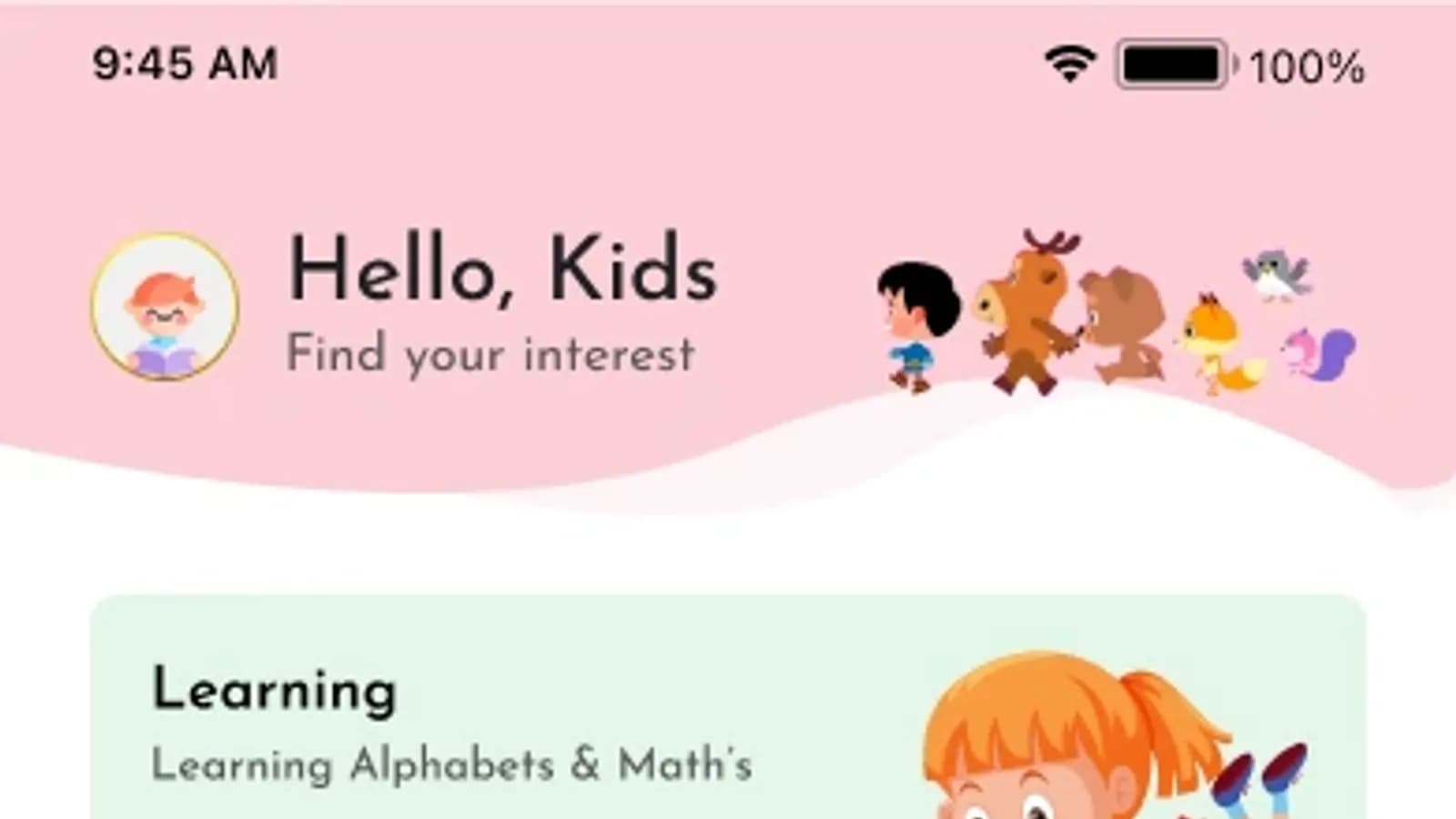
This is the category our own app, Kids Planet, belongs to: a learn-and-play app for iOS and Android that helps children learn through interactive games and activities, designed to be safe and engaging for young learners.
Does a children’s learning app need a login?
Usually not for the child. A young child should be able to open the app and start playing immediately. If you need accounts for syncing progress or subscriptions, create them for the parent, keep sign-in behind the parent gate, and collect only the data the feature genuinely needs.
If you are planning a learning app for schools, tutors or families, start by writing down the age group, the skills you want to teach and how parents will feel about it. You can read about our work in education and edtech and our mobile app development services, or share your idea with us and we will help you shape a first version children will actually use.